Charles Lowe & Sons floors used in London mews renovation
Our plank and herringbone flooring was commissioned for the master suite, bathroom and staircase of an 1880s mews house in the Royal Borough of Kensington and Chelsea. We handcrafted bespoke elements for this luxury project with a very contemporary interior.
Oak stairs provided a tradtional contrast to the contemporary finish.
Architects restored the frontage to a traditional Victorian character whilst modernising the interior with a new, contemporary open plan layout. They dug out a basement to house a spa, yoga wall and games room.
A feature staircase links the three storeys, from basement to loft
The stairwell was the biggest challenge. Each floor was a slightly different shape and ceiling height, which created an immense planning and engineering headache.
This is a Rich Generations finish on the staircase.
Made of steel and frameless glass, the industrial aesthetic of the stairs needed to be softened by inlaying dark stained oak into each step. So, working with Galower Build, we created the effect of a natural flow by producing bespoke components of oak infills, polished in our hand planed Rich Generations finish.
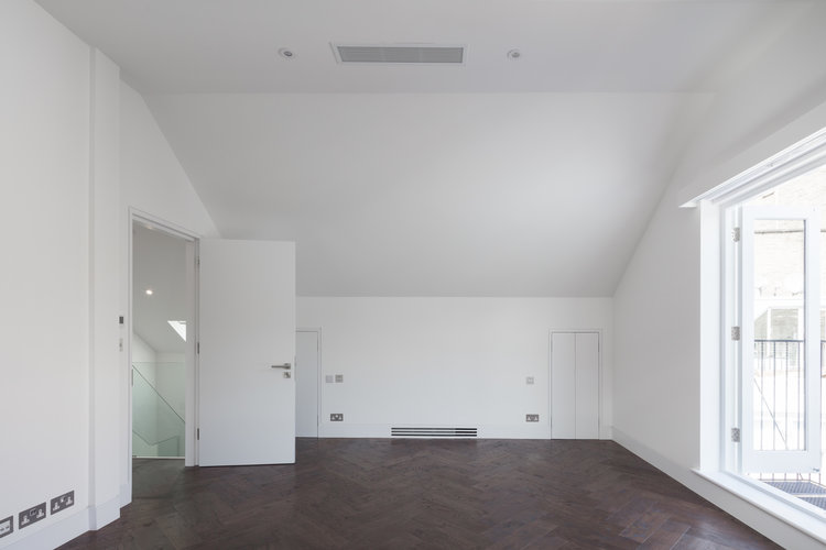
Moving to the second and top floor, the half landing of the stair is inlaid with our herringbone oak flooring to ease into the top floor. Our dark oak herringbone in our Bistre and Rich Generations finish runs throughout the bedroom, landing and into the ensuite.
Our herringbone boards were used to clad the walls of the ensuite bathroom, to complement beautiful chevron stone tiling on the floor and shower area.
Straddling the line between new build and renovation
Our Managing Director, Gordon Lowe said: “I like the mix between keeping the old character of Victorian or Georgian buildings – which I find beautiful – but modernising the interior. It's interesting because it is such a contemporary and very modern space, yet they have put our Rich Generations floor in there to soften the look with a distressed, hand planed finish. It also gives a sense of longevity to a highly curated, gallery-like space.”
Herringbone dark flooring with stark brilliant white walls is a stunning vision.
Each floor had to be a different shape
Dyer Grimes Architects described this project as ‘an almost impossible end-of-mews jigsaw’ because a huge element of this project is that there are very few parallel walls.
The unusual dimensions of the site meant that no two floors or rooms had the same shape. Each required a new approach and bespoke materials to squeeze the most out of the space, becoming multiple mini-projects within the larger project.
As the client explains, “The site is essentially squeezed into a corner between the buildings on either side. On the left, the whole wall is at a 15 degree angle, while on the right, various protrusions jut in from the neighbouring building, meaning each floor was a different shape. For example, one wall of the kitchen is at a 15 degree angle, so the units were precisely cut in such a way that they created the illusion of a parallel wall. Unless you look closely, you don’t notice the odd shape of the room.”


